From not wanting to be looked at closely, to customers asking if they can take photos
15 ping (about 50 m²) · rented space · layout untouched · reversible
Planning approach
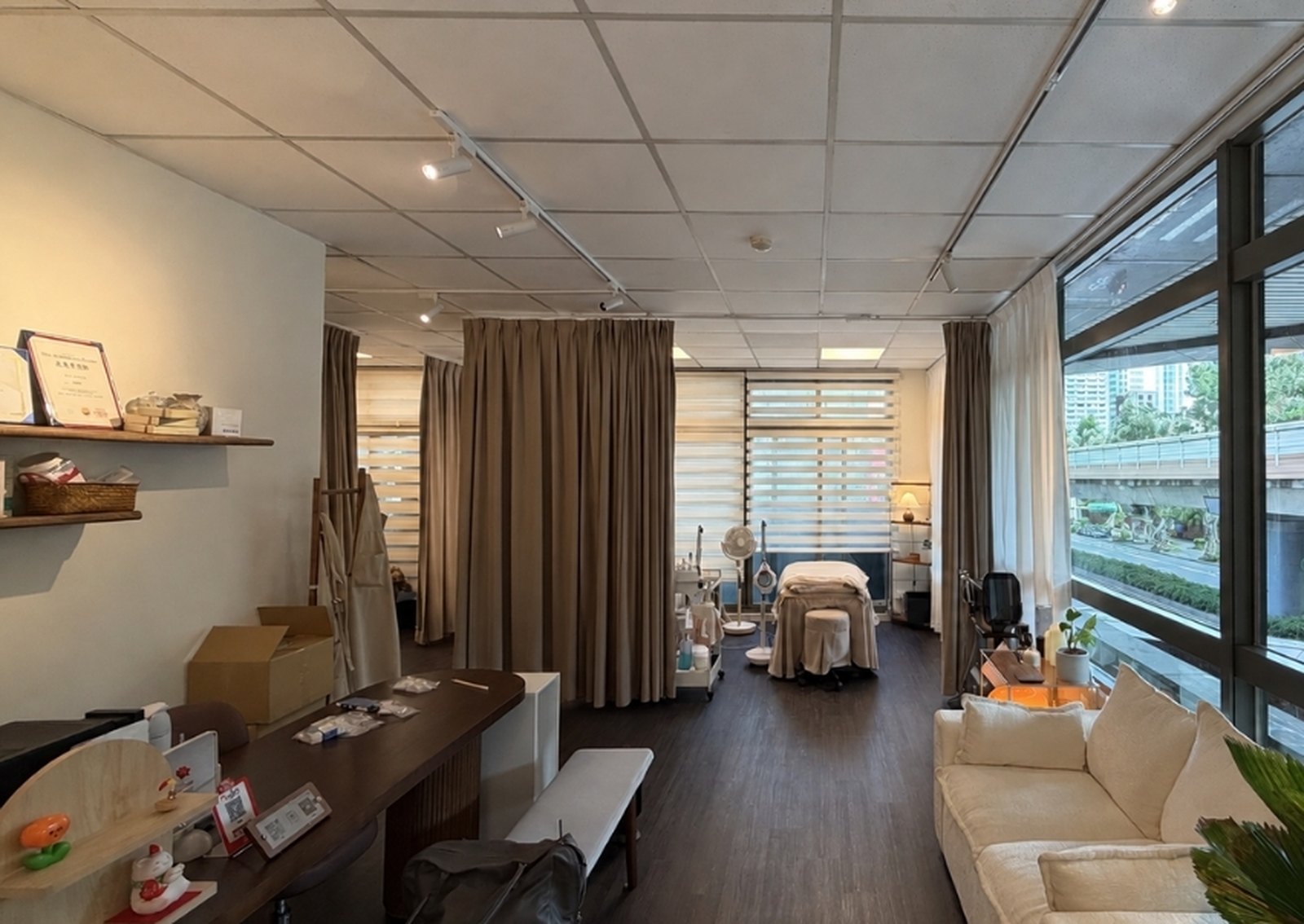
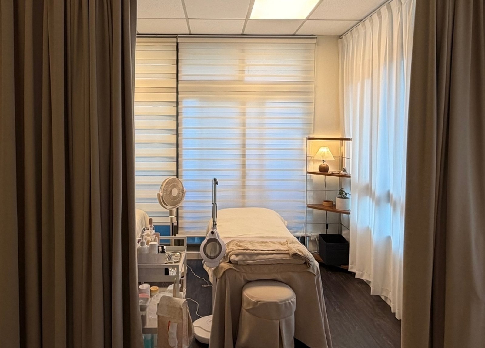
A light steel ceiling grid and flat panel lights gave the space an office feel. Dark curtains and furniture made it dim, and counters and trolleys held a lot of items.
- 01
Re-zone the space
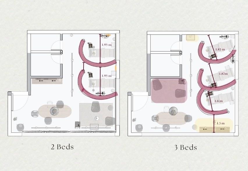
Arrival, display, treatment, departure and storage: each zone matches one action of the customer. The layout also leaves room for a third bed later.
- 02
Make the brand and the space feel like one
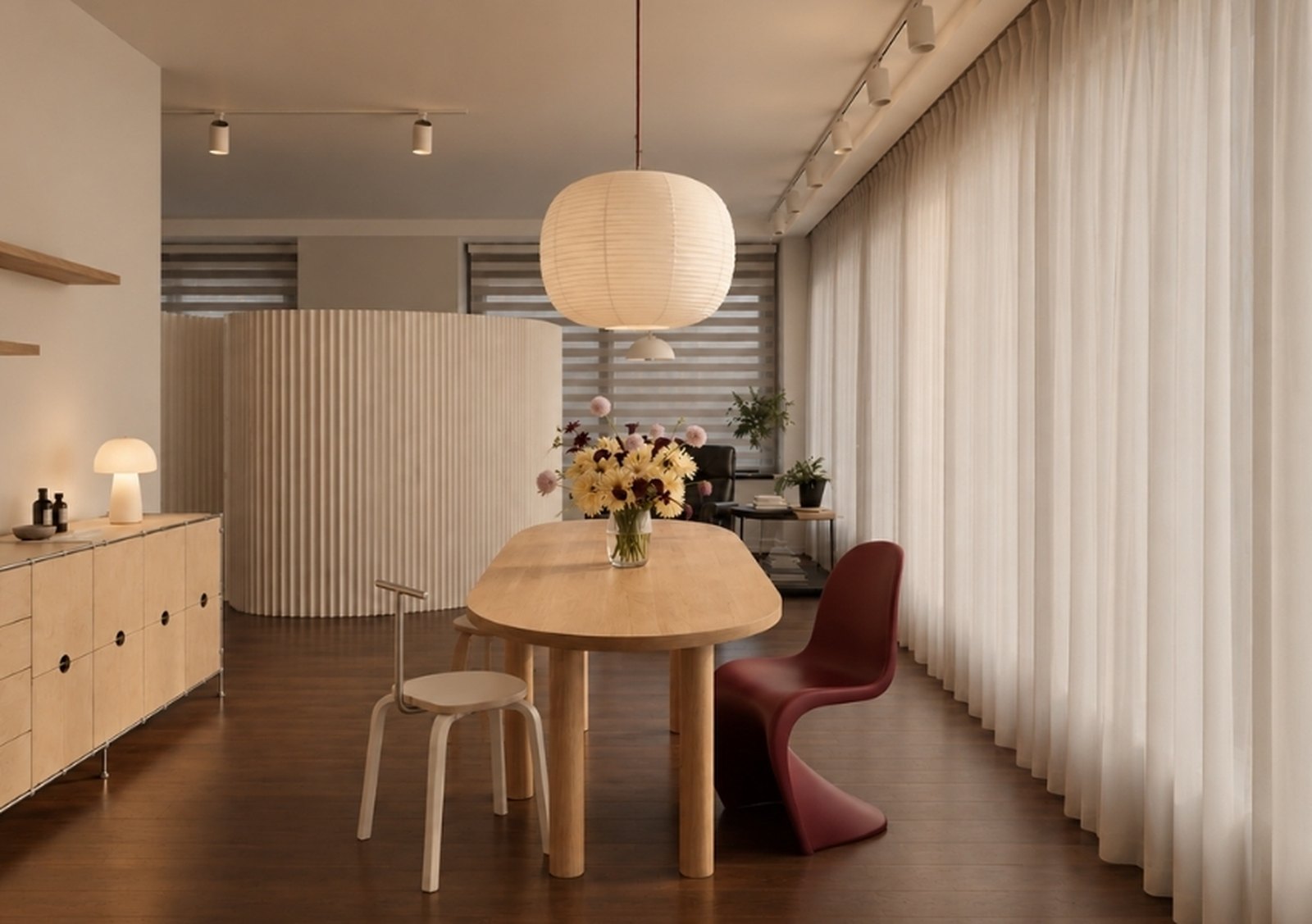
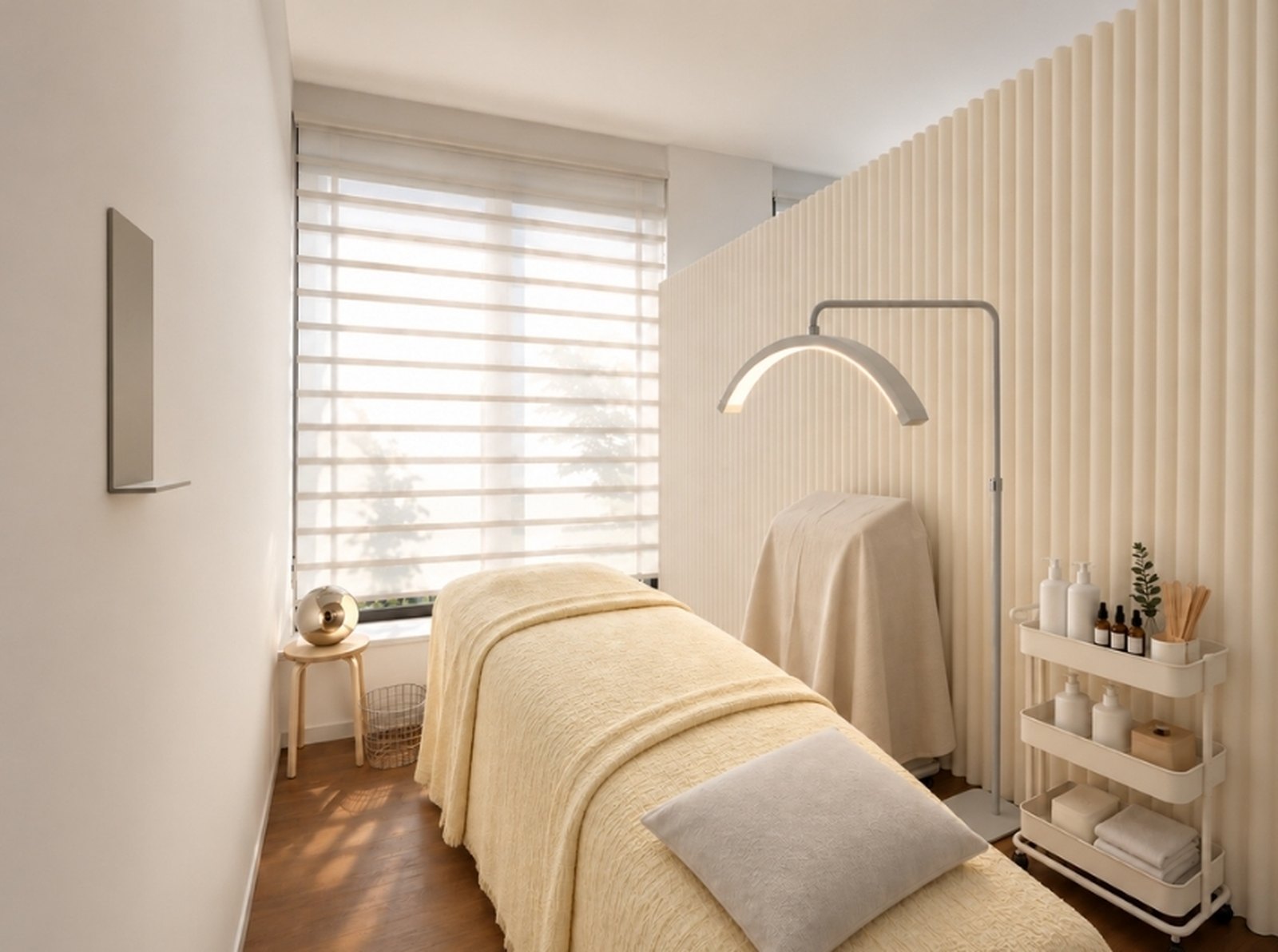
Starting from how the brand wants people to feel, we chose materials, colors and lighting for a space that is refined and never commercial.
- 03
Plan the whole visit as one experience
From taking off shoes at the door, the chat before treatment, waiting and browsing, the treatment itself, tea in the departure zone, to paying and leaving: each step has a place and a small suggestion.
- 04
Start with changes that can be undone
Wallpaper, lighting and furniture first, leaving the existing fit-out untouched. The ceiling can be dealt with later, depending on the space.
Case details
The result looks exactly like the render, and your measurements were so accurate. Amazing.